
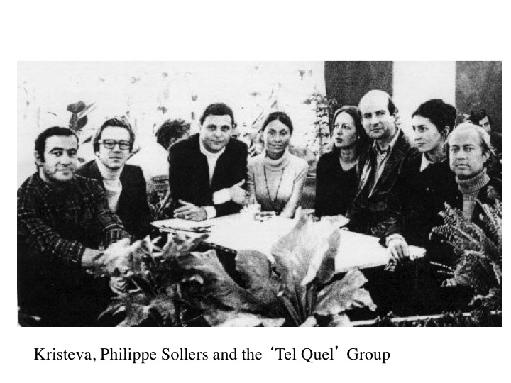
Art slides and case studies


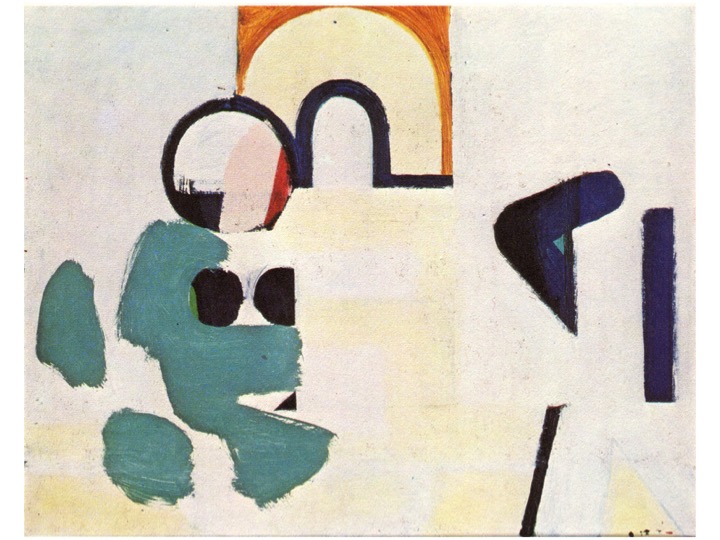


Howard Hodgkin (1932-2017) ” Interior 9AG” (1972) – The subject here began with a depiction of two figures in a an interior space in London, two collector friends of the artists in their home. One figure remains vaguely discernable in the form of a yellow vertical with two legs appearing below, coming in through a door on the top left. The interior space, with wooden parquet, carpet and cream walls is alluded to in the bottom left and top right of the painting, but already the abstract improvisation has begun to obliterate the recognisable figurative features to form a new pictorial structure.
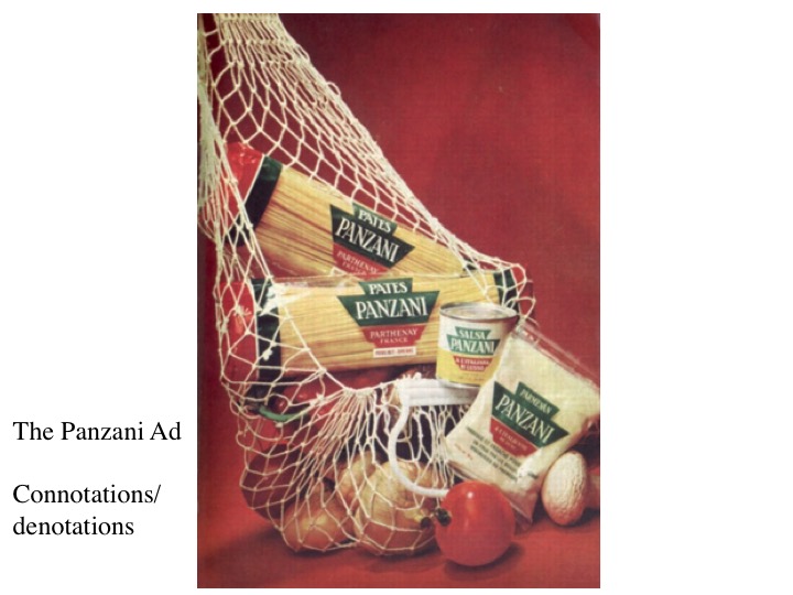
In “Mr & Mrs EJP” (1972-3), perhaps Hodgkin‘s masterpiece, the subject is exactly the same as the previous example, except in this iteration, the two figures have merged into one dominant presence – the great green egg shape which fills the composition. It is no longer a question of photographic mimesis, but of a linguistic translation of the ‘presence’ of the two figures in an interior space, presented within the terms of a new signifying practice. The question is not how do you paint the optical appearance of two figures in a room, but how do you paint the psychological impact of two personalities in an interior space? For this task, a new ‘language ‘ is required, with its own grammar and syntax. Despite its apparent strangeness, Hodgkin’s work is, he insisted, “entirely representational”.
Giotto di Bondone , (1266-1337) “The Annunciation” (Arena Chapel, Padua) . For Giotto, at the start of the Renaissance, the problem of how to map out an illusionistic space on a flat wall, was assisted by the beginnings of linear perspective. Here the sideways-on view into a basically cubic structure with one side sloping off into an abstracted distance, provides just enough of an illusionistic space to ‘house’ the newly ‘three dimensional’ figures. The play of uni-directional light, illuminating one side of the forms suggests that they are indeed ‘solid’. Giotto masterfully uses this rudimentary architecture to elucidate the dramatic action: there are three distinct spaces: on the right the heavenly space from which the annunciating angel emerges, breaking abruptly through the window the space occupied by Mary, at the centre of the drama, and the third, minor space, occupied by the maid-servant. The narrative passes (right to left) from the divine, to the divinely touched, to the normal everyday world – inhabited by us and the maidservant, personified (incarnated) in three bodies, who inhabit the three distinct realms. And the religious message is enacted from left to right: from the earthly, by devotion to the divinely touched, we aspire to the world of the divine. Giotto is the master for dramatic clarity. There is nothing else that distracts from the directness of the story, only subsidiary facts (the bed, the sparse items of furniture etc) which help to make the story more convincing.
In “Dining/Kitchen/Living” (1980) by UK Pop artist Patrick Caulfield (1936-2005), the fact that realist painting is a (linguistic) convention, amongst many others, is made abundantly clear. Caulfield demonstrates that is clearly possible to use several different representational styles, within the same picture, and still retain sufficient veracity as to make the subject appear easily ‘readable’. In an early approach to post-modernism, Caulfield shows the arbitrary nature of each linguistic type – the world can be described/depicted in many different ways, and still there is a structure which provides sufficient coherence as to render communication possible.
Louis Marcoussis (Ludwik Kazimierz Wladyslaw Markus: 1878-1941) Polish/French artist. His “Still Life on a Table” (1921) is an example of late or Synthetic/rococo Cubism. Marcoussis here employs areas of all-over dots to break up the simple planarity of flat shapes which mostly comprise the picture. In his linguistic range there are three or four basic elements: line, colour, shape and position. With these four ingredients, anything can be depicted, but to provide for more conceptual complexity and variation, in Synthetic Cubism the linguistic range was extended by subdividing simple flat coloured planes, into a subset of planes covered with all over dots. It is like transforming adjectives (which describe things) into adverbs (which denote an action).
Howard Hodgin: “Memoirs” (1949), painted when the artist was 17, following his evacuation to New York, where he stayed in an appartment with his aunt. All the characteristic features of Hodgkin’s very personal linguistic ‘style’ are already evident: the simultaneity of figurative and abstract elements; the subject matter: figures in an intimate interior space, bold ‘modern’ colour, flatness – which renders distance on the same plane as nearness, angular geometry, a tendency to sharply define each separate element as a self-contained unit, a certain psychological tension, and a fairly classic overall proportion.
Hodgkin, “114 Sinclair Road” (1957-58) In this painting of a school staff-room, Hodgkin continues this synthesising approach – starting with a fairly ‘readable’ figurative representation of figures sitting around in an enclosed space, and progressively ‘abstracting’ it by an intuitive series of improvisations which move the painting more and more towards abstraction. But the aim is never to loose sight of the original image, like a theme and variations in classical music composition, or a jazz improvisation, the variations only make sense if the original is not lost.
How this approach operates can be clearly seen in “The Visit” (1963) and “The Second Visit” (1963). Both depict the same event – a visit to a hotel , walking down a long carpeted corridor, with a door at the end. Between the first and the second variations (the visit was in fact one event, represented two times, not two separate visits) different elements of the depiction/story have been obliterated – in one there remain traces of figures, feet, skirting board etc, in the other there is more a sense of recession, with the arched door at the end of the corridor and a sense of figures/activity in the foreground.
Hodgkin “Anthony Hill and Gillian Wise” (1963 – 66). In the first phase of Hodgkin’s work, from 1950 to around 1963, the artist works from an image towards an abstraction by slowly obliterating unnecessary details. As in this painting of two artist friends in a domestic space. The all-over dots (derived from Synthetic Cubism) have begun to animate or even dominate the scene.
“Lunch” (1970-72) is more closely linked to Synthetic Cubism, as it presents its subject through clearly decided bold areas of colour – flat, striped or dotted. The residual elements of horizontal table, around which three figures incline is barely evident. The abstract improvisation has begun to dominate.
The link to Synthetic Cubism is clear in comparison to Juan Gris‘ “Fruit Dish on a Table” (1916) which employs the same device: superimposing flat coloured planes with planes covered in regularly spaced dots. José Victoriano (Carmelo Carlos) González-Pérez (23 March 1887 – 11 May 1927), better known as Juan Gris was a Spanish painter, close to Picasso and Braque, and with Fernand Léger, was one of the four leading exponents of Cubism.
UK artist David Hockney (b.1932) similarly draws on Synthetic Cubist ‘tropes’ in his paintings and Stage sets from the 1990s. “The Twenty-first VN Painting” (1992) (Very New Paintings) is one of a long series begun in 1992, whose first iteration was “Where Now?” (1992). The work embodies a change of direction for Hockney after his monumental opera stage sets and a reference back to Synthetic Cubism in creating more abstract conceptual landscapes where the spectator is fee to explore a different kind of space.
Barbara Kruger (US, b.1945) “Remote Control” is the title of her book from 2012. her characteristic work spells out critical commentary on social, gender, power, racial issues and attitudes in a combination of stylised black and white photographs (often from the 1950s – the start of consumerism) overlaid with red or white helvetica bold or futura texts. The messages are often accusatory, imperative, and in the second person. They are exhortations to action and protest, or accusations of wrongdoing, or again, simply stating positions held (right or wrong): “You Rule by Pathetic Display” (1982) “You are not Yourself” (1982)
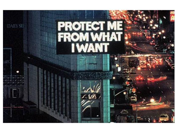
Jenny Holzer, US (b. 1950) “Truisms” (Spectacolor Display Board, Times Square, NY). US artist Jenny Holzer creates textual displays using contemporary advertising electronic billboards sited in public spaces. Her message is usually provocative, striking and highlights fractures and contradictions in the social fabric. Using the technology and the spaces/locations of consumerism, she critiques both and always seeks for a more radical, humane alternative to the rule of money and power.
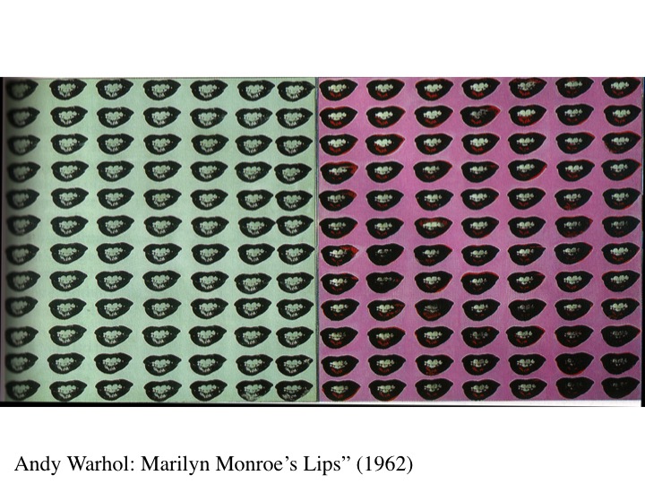
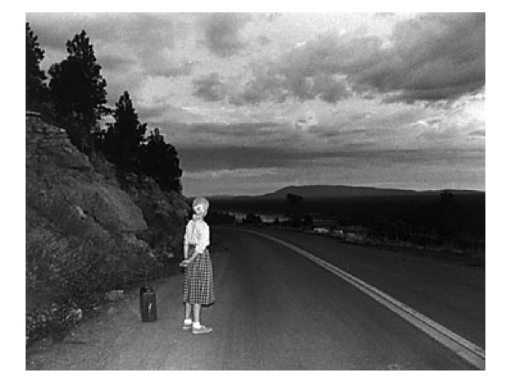
The subject of Cindy Sherman‘s (US, b.1954) work is always herself, or rather the Self and how it is constructed through imagery. Starting in her twenties she has always found new ways to photograph herself, in multiple disguises, wearing costumes, make-up, wigs, even prosthetic body parts, and posing herself in carefully elaborated stage sets to suggest an era or environment. Her ‘Untitled Film Stills” in black and white suggested scenes from a vaguely familiar 1950s movie with herself as housewife, film star (with references to Marilyn Monroe, or a character from a road-movie) or a vulnerable female in or escaping from a dangerous situation. It is important that she takes the photos herself so that she is in total control of her image (not a male photographer for example) as she is always exploring aspects of female identity and self-perception, using herself as her basic material. She demonstrates how mutable and prone to pressures contemporary female identity is.
The US collective, Guerrilla Girls (formed 1985) is an anonymous group of feminist, female artists devoted to fighting sexism and racism within the art world by public advertising campaigns in magazines and posters often outside National Museums, as here The Metropolitan Museum, New York. The group formed in New York City with the mission of bringing gender and racial inequality into focus within the greater arts community. They wear Guerrilla Masks in public and keep their individual identities secret.
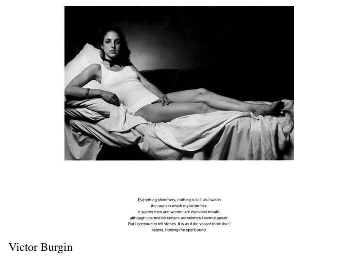
UK photographer, writer and Conceptual artist Victor Burgin (b. 1941) employs semiotics directly in his work. Here drawing on Barthes’ analysis of photography to subvert Manet’s “Olympia” by altering the race of the model and providing a text concerning gender relations, which operates in parallel with the image to help determine its meaning.
Damien Hirst (UK, b. 1965) is an artist, entrepreneur and collector who rose to fame/notoriety in the 1990s for his often controversial works involving dead animals preserved in formaldehyde, but also for his curation of a generation of artists who became known as the YBA (Young British artists) who have dominated the UK art-scene ever since. He is also known for his workshop method – he employs around 400 assistants to make the works for him (as Rubens did before him) and here in the “Dot” paintings he allows the assistants free reign to choose the colours. It is the concept which Hirst claims as his own, not the individual manufacture.
Michael Craig Martin (Irish b.1941) who was Hirst’s teacher at Goldsmith’s College was brought up in Washington DC and educated in a French Lycée in Bogotá, Colombia. He is one of the key figures in UK art education, whose students have become the core group of the YBA, Turner-Prize Winners and visible international artists. This work, “An Oak Tree“, (1973) is like Kosuth‘s “Three Chairs” one of the key Conceptual artworks, comprising a glass of water on a glass shelf with a text explaining how ‘in fact’, the object is an oak tree. Since 2011, Craig-Martin has been working on powder-coated steel forms that describe everyday objects and appear like line drawings in the air.
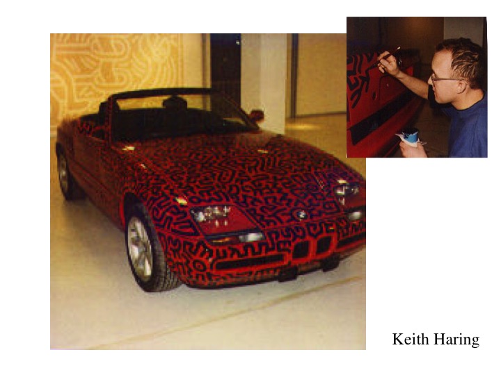
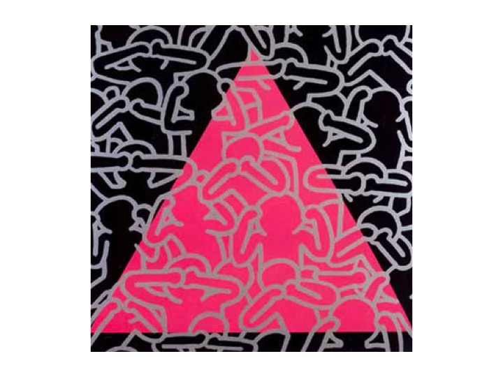
Keith Haring US Pop and Grafiti artist (1958-1990). “Customising a BMW convertible” (1990) and “Silence = Death” (1989). Haring’s work began as anonymous chalk drawings on blacked out advertising panels in the New York Subway. He appropriated these liminal spaces (post and pre-advertising) as a free space to distribute his own unique style of energetic, all-over linear grafiti, populated with strange creatures, space-ships, crawling babies, barking dogs and dancing figures. He was always a political activist, in this work spelling out the importance of reliable information and public awareness in the fight against AIDS, which he himself had contracted and from which he eventually died.
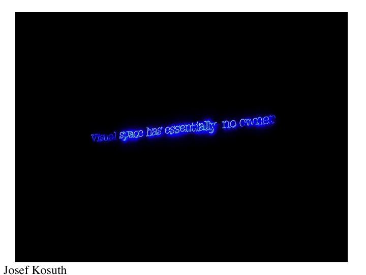
US Conceptual artist Josef Kosuth (b.1945) uses written language as his principal artistic ‘material’. Texts, printed or as here, in neon form spell out a philosophical message about perception, about the nature of art and its relation to language. Linguistic Philosopher Ludwig Wittgenstein is a constant source of inspiration. He was even part of a UK/US conceptual grouping called “Art & Language” in the 1960s, whose magazine of the same name contains some the key documents of conceptual art.
Joseph Kosuth, “Three Chairs” is a deceptively simple work: it presents three versions of a chair – a photograph, a verbal description or dictionary definition, and a physical chair. Are they all the same? Two would appear to be representations of a chair whilst the ‘real’ chair is just itself. But for Plato, even the physically present chair is a representation of the ‘concept’ of a chair, without which it could not exist. For idealists, the ‘real’ chair exists only in the conceptual realm.
Mike Kelly (1954-2012). A US Conceptual artist whose playful work involved ephemeral installations using found objects like textile banners, drawings, deodorant dispensers, assemblage, collage, performance and video. He often worked collaboratively and had produced projects with artists Paul McCarthy, Tony Oursler, and John Miller. “Zen Garden” was part of an installation involving blankets and stuffed soft toys. Like Zen, the presence of the bear under the blanket is to be deduced by its absence.
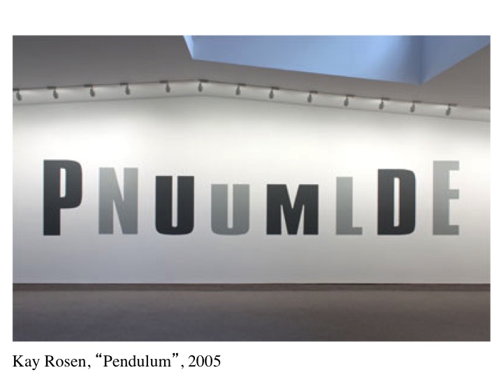
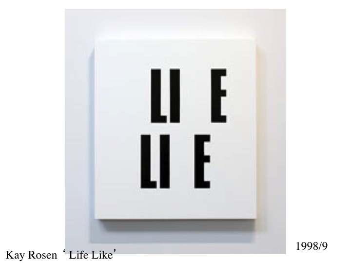
US Conceptual artists Kay Rosen (b. 1943) paints text, usually simple letters, onto gallery walls in site-specific installations. The word thus displayed is presented in such as way as to suggest its meaning through the manner and placing of its depiction. As here in alternating positions and diminishing sizes.
Sometimes, as in “Life Like” (1989/9) the title provides the missing letter and the clue to the painting – a reference to our reliance on texts to ‘explain’ paintings.
Or in “Tent” (2008/9) it is the placing and ordering of the letters to be read that gives the meaning. As with Kosuth, the written text creates a mental image or concept, which then gives meaning to the visuals before us.
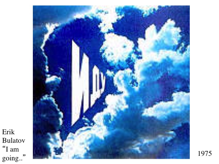
Russian artist Eric Bulatov (b. 1933) is a classically trained figurative painter who combines his representational skills with text – often slogans or brief statements – such as “I am Going” (1975) here, superimposed over a cloudscape in a perspective which enhances the feeling of distance suggested by the words, Bulatov, like many contemporary artists, responded to the feeling at that time that figurative art was no longer sufficient to carry meaning in the face of the conceptual weight of words.
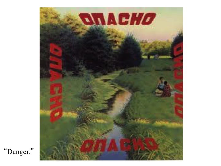
In “Danger” the threatening words in red are superimposed on an otherwise idyllic landscape, suggesting the sense of omnipresence of danger in our post-modern world. Is it the peaceful picnic or the traditions of painting that are in danger?
