
Just Looking..

US writer John Updike entitled a late book thus. It comprised a series of personal reflections about paintings he had stood in front of. Sometimes, these reflections dipped back into art history, the social conditions prevalent when the work was made, the context from which the work emerged, but often, they were just personal musings inspired by the paintings; reflections about what they might mean; how they were intended and understood at the time of their making, and how contexts have changed over time. I used the title “About Looking” as the basis for a series of lectures delivered in the Seminar of Aesthetics at Masaryk University, Brno, CZ, in 2014, and thought to continue them here in an occasional series, when time and space allow, because I have stood in front of many tens of thousands of paintings over the years, and have a huge collection of images in my head, and many thousands of thoughts about these images, accumulated over the last 50 years.

Some of these might be interesting to others, or at least might encourage independent investigation into the enormous resource which is art history, which can give so much pleasure, knowledge, and wisdom about what great things humans are capable of, when they are not focussed on designing weapons systems, or seeking after endless money and profit at other’s expense.
The idea, then is to upload, in no particular order, some reflections about art – what it might be, how and why it was made, and what it might mean to us now.
I start with a reflection about ‘personal opinion’. It is a commonplace to hear that ‘everyone is entitled to their opinion’, and I suppose, within the confines of one’s own, isolated head, perhaps this is true. But if your opinion is deliberately ignorant, unscientifically inaccurate in the face of provable facts, racist, misogynistic, xenophobic, demonstrably illogical, false, and so on, what sense does ‘your opinion’ have? As philosopher Richard Dawkins says,
So too, ‘opinions’ about art – What does it mean to say ‘I don’t like it’ when confronted with a work of art, if the speaker has put zero effort into educating him/herself about the centuries-long traditions of art-making, the socio-political context of its making, the various functions it has served over the years, how these have changed, the developments in style from Byzantine, to Baroque, and from Renaissance to Mannerism, to Rococo, neo-classicism, not to mention all the ‘isms of modernity – Impressionism, Fauvism, Cubism, Expressionism, Primitivism, Surrealism, De Stijl, Abstraction etc. etc. Would this same person wander into Einstein’s lab, quickly scan the chalk blackboard, crowded with mathematical calculations and declaim confidently: “I don’t like it’ – or perhaps unwittingly, “It’s a waste of space/time”…
Well, of course, sadly, they might, but what would be the value of their opinion in the grand scheme of things? As Dawkins suggests, gravity really doesn’t care whether you ‘believe’ in it or not.
So the first point to make, when reflecting on what an art work might mean, is to assume a position of humility and ignorance until such time as one has read a few things, seen a few things, had time to think about a few things, and to reserve one’s ‘knee-jerk’ reaction as to whether “I like it’ or “I dislike it’ until such time as one has informed oneself about the history, purpose, technique, function, alternative possibilities and socio-political context of the puzzling artefact that one is looking at.
Titian’s “Bacchus and Ariadne” (1520-22)

Almost the first art-book I bought, about 1968 when I was 13, was this little gem by William Gaunt (1959, reprinted 1968) for 6 shillings (£0.30, but probably more like £6.00 in relative value now). I bought it partly for the cover, which I instantly loved, because it straightaway told me that painting was about colour; and partly for the charts on the inside endpapers, which seemed to make the entire History of Art accessible, logical and easy to follow:
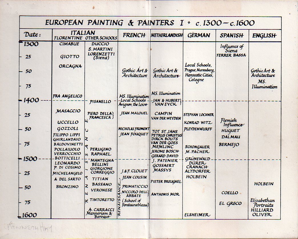
Of course, I understood that this was not the whole story, that there were many gaps and elisions, (women artists, and non-European civilisations etc to name but a few), but it provided a framework by which to deal with complexity, and that is what learning anything needs, and what the arts are specifically geared at providing.

When I say that painting is about colour, I mean that of the various components/ingredients which go towards making a painting: scale/size, drawing, composition, (in 2D and 3D – more on this later), spatial illusion/flatness, and colour, it is with colour alone that a painter can truly operate his/her craft – Many painters can draw, or compose in 2D and 3D, and deal with scale, illusion and flatness, (some better than others) but surprisingly few painters have truly mastered colour. This may seem rather surprising given the vast numbers of artists there have been, but to an eye sensitive and attuned to colour relationships and harmonies, the number of true colourists in art is surprisingly small. Artists like Toulouse Lautrec and Picasso are predominantly and consummately, draughtsmen, but they use colour as an extension of drawing, whereas Braque is a consummate colourist. You will never find the perfect harmonies of acid lemon with chocolate brown or dove grey and lime green, which are typical of Braque, in a Picasso. For Picasso, the idea and the image are instantly communicated in vigorous drawn form, colour is not so essential. There is a mental/visual concept, and then its execution as directly as possible. For Braque, colour harmonies and dissonances are the essential, and the concept lurks and broods somewhere in the depths of the painting, emerging slowly and thoughtfully like a harmonic structure in Bach. So with Titian, it is the colour which grabs my eye – the particular alternation of pink and blue, orange and green, black and yellow. Of course the composition has been elaborated across the surface: the rush of figures pressing in from the right, seemingly stopped or repelled by the gesture of Ariadne on the left, so that Bacchus’ flight has been arrested in mid-air, the foot which should be carrying his weight, left suspended in space, but the organisation of the colours across the surface does something else, and is primary.
I mentioned composition in 2 and 3 dimensions above. What I mean by this is that in the development of depiction, from cave paintings onwards, there has always been a set of tensions created (Eventually, this became known as the ‘Figure/Ground’ relation). The moment our cave ancestor made a mark with a burnt stick or his chalky fingers on the cave wall, a tension is created between the surface on which he is drawing, and the illusion of empty space created by line. Once you have a line or two, or a depiction of a Bison, the cave wall becomes the ‘background’ against which the drawing stands out. Ever since then, painters have exploited and played with this illusion of space and depth. In cave paintings, like the Chauvet Caves in France, for example, the ‘artists’, and I think we can call them thus, were not necessarily concerned to make a coherent illusion of space, nor to ‘compose’ their animals in logical or receding order, ‘back’ into the illusory depths. But with much later art, in the Middle Ages and Early Renaissance, artists became aware of these two contradictory aspects of composition. A board (more usual than a canvas at this time) was firstly a flat surface bounded by its edges. A composition involved placing shapes, representing figures, trees, hills, buildings etc, into this framework in a pleasing and organised fashion – in 2 dimensions, across the surface, as a flat pattern. But the illusory third dimension is always present, and increasingly, as the early Renaissance developed into High Renaissance, the artists’ awareness of the simultaneous illusion of depth, ‘into’ space, behind the surface, as well as the patternistic arrangement ‘on’ the surface, meant that the ‘modern’ painter had to be simultaneously aware of making a successful arrangement across and on the surface in 2D, as well as grouping and organising his figures, shapes, trees etc., receding ‘into space’. Not all painters mastered these two conflicting compositional skills. Titian does, supremely. We read the composition, from right to left, in opposition to the usual mode of reading in the West, in terms of the picture surface, but also, the central gap or lacuna, leads the eye into a plunging perspective of distant coastline, city and circling hills, receding in depth from the front of the canvas to the illusory distance behind.
Perhaps the most extraordinary objects in the painting, painted diagonally opposite each other, in an opposing vector to the right/left thrust of the main composition, are the two pieces of drapery: Bacchus’ flowing and curling rose robe, caught in the wind of his movement, billowing and frozen in mid-air, and the crumpled antimony yellow drapery, so artfully composed to occupy the bottom left corner. Without its touch of brightness, the bottom left of the composition would be lacking, the energy of the whole composition would drain out and disappear. It has so obviously been ‘placed’, as one would a drapery in a table top still life; It has been laid and carefully arranged, in folds and ruffles to catch the eye, its tone brighter than the foreground on which it is placed. It has no other purpose than to keep our eye circulating, moving upwards, catching Ariadne’s right foot and up through the curve of leg, drapery and red ribband, to grasp the momentum of her action, which in turn, stills the whole composition. Her gesture pushing backwards with her right arm, bearing the whole force of her body, mirrors and reverses that of Bacchus, similarly caught, turning so that the full force of his body is pivoted onto his right arm, thrusting down where Ariadne thrusts upwards.
It is an endlessly fascinating and endlessly moving image. Time, the domain of Deeds, is frozen and for ever suspended, and the colours call out to one another across the frozen expanse.
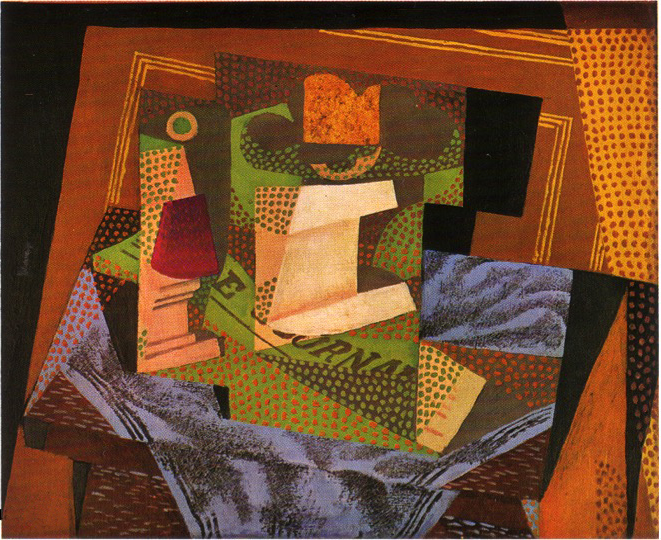
Picasso’s “Portrait of Ambroise Vollard” (1910)

The Image comes from an excellent survey book, “20,000 years of world painting’ by P.P.Kahane, P.Francastel, G.C.Argan, Michael Levey, Hans L.C.Jaffé and H.Hetl-Kunze, Harry N Abrams, NY, (1967) which filled many of the gaps, though not all, of Gaunt’s little book. Up in Inverness, Scotland, as a young teenager in the 1960s and 1970s, I had not, until then, been exposed to Cubism, and this image, in its Analytic form, was a revelation. So much so, that I immediately started to paint my own ‘versions’ of analytic Cubism in oils, with which I had been experimenting for a while. Somehow, I intuitively understood the play of space and detail which had occupied Picasso. He gives us just enough information about a nose or a lapel, and then reminds us that this was just an image after all, and here is another directional black line on a flat surface. The ins and outs of a space, were just shallow enough to hold a three dimensional form, but not like the ‘box-like’ space of Renaissance perspective in Giotto or Piero Della Francesca.
What was immediately clear, was the process of making which Picasso had followed while standing in front of his subject: the process of looking, and focussing on where things meet – where a collar meets a neck, or where a nostril meets a cheek. He has observed closely, synthesized his look into a descriptive mark or two, and deliberately not tried to hide the rough and decisive character of his brushstrokes. Each one stands for a decision made: “The world is made of millions of details, but for now I will make this mark to sum up how a nostril turns”. For this essentially plastic representation, colour is not really needed much: A few local colours – pinky orange for skin, grey and black for almost everything else: suit, wall, space, will suffice. Typical of Analytic Cubism – the early ‘exploratory’ phase of Cubism from around 1910-1914, (the ‘voyage out’ into uncharted territory) – the focus of the painting occupies the centre of the canvas, where most of the energy and directional brushstrokes are concentrated. As the image emerges from its surrounding space, the four extremities or corners of the canvas lose their interest for the painter, and the mark-making tends to ‘fade out’. Eventually, Picasso and Braque realised this, and dispensed with the four corners by painting on oval canvases, so typical of middle and later Cubism.
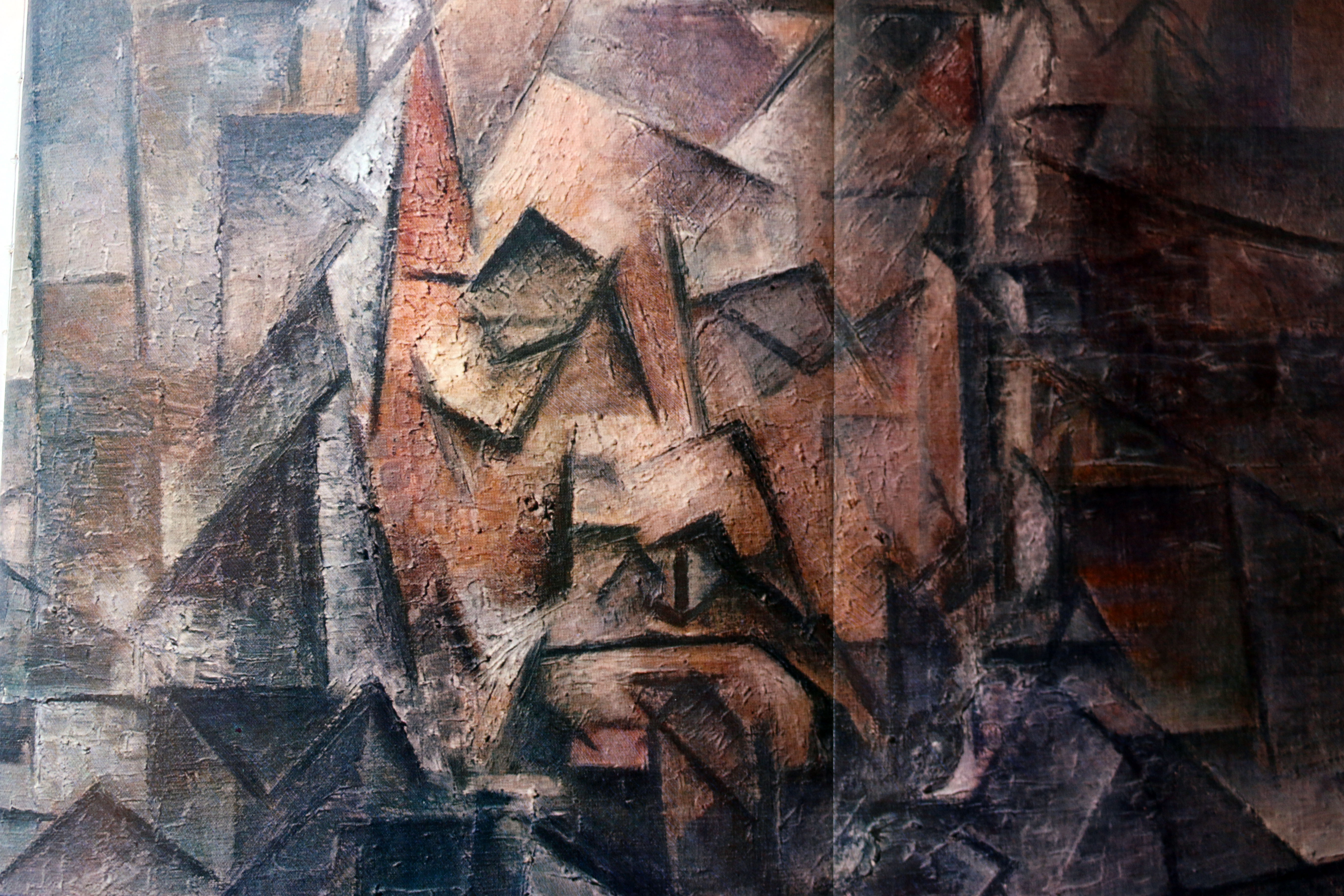
Incidentally, despite Picasso’s stylisation and the apparent liberties taken with the physiognomy of his subject, the portrait is entirely recognisable as the friend and dealer we know from other portraits, by Renoir, for example, and from photographs of the time.
What Picasso’s “Portrait of Ambroise Vollard” demonstrates, is that painting can be an exploration into the unknown. By concentrating not on anecdotal detail, but on broader issues of space, light and form, the subject in front of the painter can become the starting point for an intellectual research into how things might be, how things can be re-imagined, and the result may be a surprise, even for the painter. Rather than just attempting to ‘copy’ nature or follow a photograph, the artist, just by looking and thinking, can conceptualise a whole new way of representing reality. Indeed, this might serve to define ‘originality’ in an artist – the ability to find something new in something that has been looked at before. There have been thousands of portraits painted, but none like Picasso’s “Vollard”.
Pink and Grey

Although not mentioned in the title, Whistler’s portrait of his mother is in fact enlivened by the areas of pink and yellow in the face and footstool of the composition. Without them, the painting would be a near monochrome, and less interesting as a result.

So what is it about pink and grey that has drawn so many artists over the years? In the example by my teacher, Lawrence Gowing, above, the pink equals warmth, humanity, and light, offset by the grey of space, setting, and context. The painting is divided more or less equally by a jagged, stepped diagonal, which ascends from bottom left to top right. The brightness of the book and knees draws our eye to the front of the picture plane, while the receding foot points into depth. The subject is his wife, Julia Strachey in their apartment at Chilton. But one can perhaps deduce that from the quiet intimacy of the expression. As colours, both grey and pink are cool, because of the quantity of white mixed in with the paint. Pink is blood red plus white; Grey is darkness plus light. Together they form a subtle harmony of fleeting quietude.

But it is Goya who is the real master of pink and grey. The combination appears repeatedly in his work. The greys are pearly and silvery, dove grey and smokey. The pinks, reserved for flesh tones, have an undertone of grey too, and rise to an almost red with the quantity of blood circulating under the skin. It is as if everything is in fact grey, but only our life energy raises the temperature a little, for a while.

So it is, explicitly in the late self portrait with his friend and Doctor Arrieta, who, as the caption proclaims, had saved him from a serious illness which had beset him at the end of 1819 in his seventy-third year. The greyish pall of the sick Goya’s skin is slowly coming back to life by the careful administrations of his Doctor. It is almost as if the deeper red of the blanket at the base of the painting is slowly rising to warm the cheeks of the exhausted painter. There are little flecks of pink in the white sheet. His hands are already quite pink, and soon, his face will match the healthy ruddiness of Arrieta. It is a wonderful and touching metaphor of healing. The pink accents of Arrieta’s ear lobe and lip, are the compositional apices of this radient ascension.
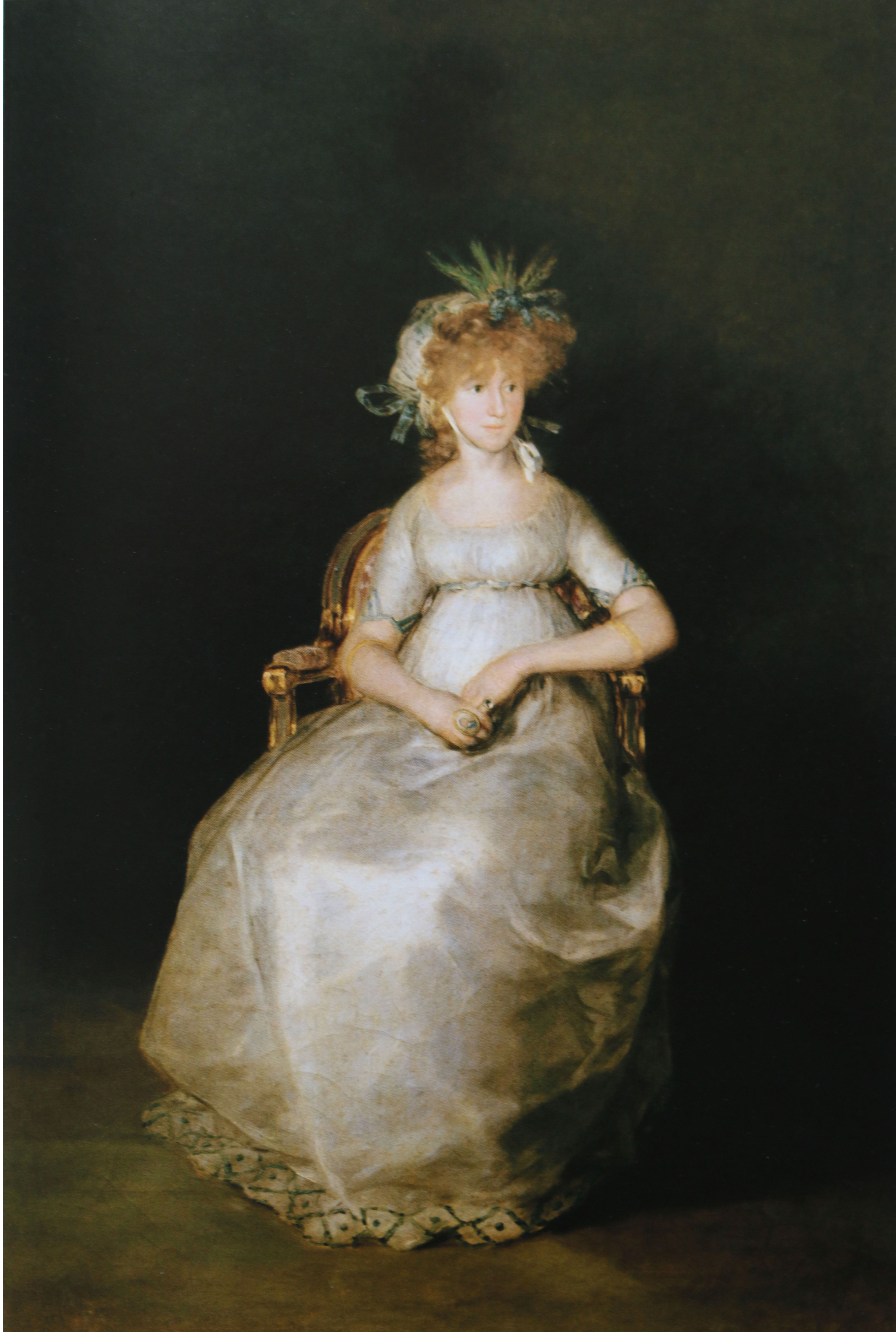
In this understated sumptuous masterpiece, Goya demonstrates the virtuosity and subtlety of expression which his use of grey and pink permitted him. He had known and painted María Teresa de Borbón y Vallabriga (1779-1828) as a little girl. Daughter of the Infante Don Luis, by a morganatic marriage, she could not inherit her father’s titles and had been banished form court to be educated at a convent in Toledo. Her marriage to Don Manuel Francisco Domingo de Godoy, the Prime Minister and most powerful politician of his day, enabled her to escape her cloistered existence and enter court life. But the marriage was a manipulation by Queen María Luisa, probably intended to separate Godoy, possibly the lover of Maria Luisa herself, from his latest lover Josefa (Pepita) Tudó to whom he had been in thrall since 1796. Godoy was thus able to marry into the Royal family whilst maintaining his mistress, whom he eventually married after the death of Maria Teresa. By all accounts, Maria Teresa loved her errant husband dearly. Jovellanos recounted how painful it was to sit opposite Godoy at dinner with his wife on one side and his lover on the other” “The spectacle filled me with sadness; it was more than my heart could bear. I could neither speak nor eat nor think straight. I fled the scene.”
In Goya’s portrait, the 19 year-old Countess sits shyly, looking down rather than meeting his gaze. Already in the early stages of her third pregnancy after two miscarriages, one of her rings poignantly holds a portrait of Godoy, who was away on military manoeuvres. “I love him more than myself, with inexplicably extreme passion. I can’t live without him”, she wrote to the Queen in 1801.
The painting is dominated by the expanse of shimmering pink/white silk dress, at times tinged with blue-grey shadows, under which one can just make out the forms of her legs. It is rendered with a virtuoso subtlety, In fact, the dress and its handling so catches our attention that we almost don’t pay attention to the self-effacing character of the Countess. Her delicate, introspective head emerges starkly from the pitch darkness of the surrounding space, a brooding metaphor for the bleakness of her psychological situation; and the fact that she looks away and downwards emphasises her vulnerability and solitude.
Pink and grey. What depths of emotion and tenderness they reveal.
Today I will draw a hare…

So, at least one may suppose, Dürer, then aged 31, said to himself. The question arises as to why. Why would an ambitious young artist, already a prodigy at 12 years old, credited with perhaps the first self portrait in the history of Art, and already an accomplished goldsmith, engraver, portraitist and landscape painter, want to spend the several hours necessary to paint a hare? Often entitled a painting of a “Young Hare” , the creature has been identified as a field hare, and a mature animal. Did he catch a live specimen and transport it to his studio? Or did he make some quick observations in the field, to be worked up later, either from imagination, or more likely, from a dead animal in his studio? If you look closely at the reflection in the hare’s right eye, you see the familiar cross-bar and bright panes of glass of a reflected studio window. But this is inconclusive, as Dürer often used this ‘trick’ to give liveliness to the pupils of his subjects.
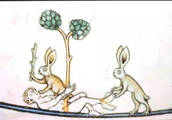
Rabbits and hares do sometimes appear in Mediaeval manuscripts, illustrating the Seasons, and suggestive of Nature’s abundance, and there is, rather curiously, a whole tradition of violent rabbits in Mediaeval Manuscripts, representing an allegory of “the World Turned upside down”, where the supposedly meek, wreak their revenge on their historic tormentors:
They also appear in some Renaissance paintings, such as Giovanni Bellini’s “Christ Blessing” (c. 1500) in the Kimbell Art Museum, Fort Worth Texas, or Andrea Mantegna’s, “Christ in Gethsemane” (1458-60) in London’s, National Gallery, both of which pre-date Dürer’s study.


Generally speaking, as in the Bellini and the Mantegna, they are included as incidental details to suggest the variety and fecundity of nature, and/or with Christian overtones, to suggest resurrection and eternal life/renewal.
In trying to answer our question above, as to Dürer’s motivations, it might be useful to look back at what he had achieved so far. As mentioned, at the age of 12 or 13 in 1484, Dürer created the first (surviving) self-portrait in Western Art.

The inscription, written later with what appears to be a mistaken date, proudly proclaims that the artists made this, ‘whilst still a child’ : Dürer never shied away from self-praise, however justified. Norbert Wolff in his recent monograph on Dürer, suggests that the pointing finger is perhaps indicating a companion piece, the drawing of Albrecht Dürer senior, also in silverpoint from this date, which may, in fact be the first self-portrait, drawn by the father to encourage his son. But it is also possible that Dürer is knowingly using the conventions of Christian rhetorical gestures, such as that of Christ blessing. There are subsequent self portraits in which he appears to adopt a Christ-like pose.
Dürer was undoubtedly an incredibly talented young artist, After first mastering the goldsmith’s trade under his father’s guidance, he then transferred to Michael Wolgemut’s painting studio in 1486, for three years. Thereafter, he set off on the travels which were to become a crucial influence on his development. First to Colmar, Alsace, Frankfurt (for its thriving art market), Mainz (the birthplace of modern printing), and Basle to see and meet the artists from the Middle Rhine: Martin Shoengauer, (who however, died shortly before Dürer arrived), The Master of the Amsterdam Cabinet, the Master of the Housebook, and possibly, according to his not entirely reliable biographer, Carel van Mander, the Dutch Master of mysterious and melancholy scenes, Geertgen tot Sint Jans. Dürer’s woodcut the”Martyrdom of the Ten Thousand Christians” (1496) is almost an exact copy, in reverse, of Geertgen tot Sint Jans’, “Burnings of the Bones of St John the Baptist”, (1484) (right wing of the “Crucifixion Altarpiece for the Haarlem Order of St John”, Vienna, Kunsthistorisches Museum).
A trip to the Netherlands at this time is not implausible, but little firm evidence exists. Panofsky notes that Dürer undoubtedly absorbed Netherlandish influences in his early work, and a drawing by Dirk Bouts, seems to portray a young artist with a striking resemblance to the young Dürer, suggesting, perhaps, that he visited Bouts’ studio.:

But it is also probable that Dürer knew of Netherlandish artists’ work through engravings circulating in Nuremerg at the time.
In 1494, aged 23, he returned to Nuremberg and married Agnes Frey, in what appears to be a marriage arranged by his father for convenience and the safe-guarding of his estate. Certainly, when the plague struck Nuremberg, shortly after in that year, Dürer left Germany, alone, to continue his travels to Innsbruck (1496/7) across the Alps, to Trento (1496) and Venice where it seems he stayed around two years.
The watercolours he painted en route are amongst the first pure Western landscape paintings: painted directly in front of the motif, with little or no reworking in the studio, and done with an emphasis on accurate observation and depiction of the world as it appeared at a specific time and place. In this sense, they are the first ‘scientific’ studies of landscape.
Whilst there is the possibility that Dürer might have made these studies to later incorporate into the background of a religious painting or commission, their immediacy and freshness suggest more that they are travel sketches, inspired by a vista which was new to the artist, recorded with freshness and immediacy, as a memento of something or some place he might never see again.


It is in the light of these, and other studies made by Dürer, of birds wings and close-ups of nature, that we are to understand the ‘Field Hare”.
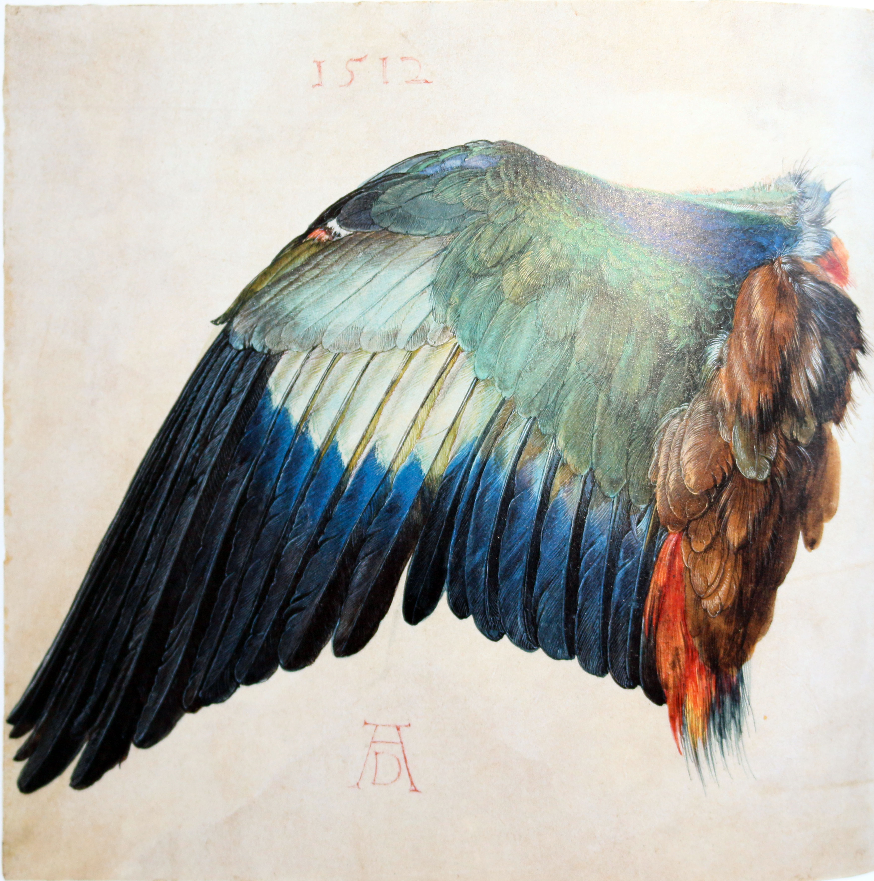
By the early 1500s, Dürer had already established himself as a mature artist, with exceptional representational skills. His woodcuts and engravings reveal a compete mastery of technique and a relentlessly accurate eye for detail. Two studies of a dead “Blue Roller”, executed either in 1500 or 1512 amply demonstrate this mastery:

Accurate representation in a manner which was scientifically ‘provable’ in front of the subject was one of the essential skills of a Renaissance artist: Either for portraiture, where the Patron would wish to see the skills of the painter demonstrated before permitting the commission to take place; or for religious painting, to make the credibility of the Biblical scenes more convincing. In either case, Dürer’s skills at carefully analysing and recording the complex detail of the natural world, so much a part of the scientific ambitions of the Renaissance, are amply demonstrated in the “Field Hare”.
Dealing with Space
Probably the second problem of depiction, once you have created your object (figure, animal, mountain..) is how to depict space. The surface on which one draws or paints is always both impenetrably flat, and infinitely recessive. Our first artist ancestor, scratching his/her nail into the surface of a limestone rock, discovered both drawing and sculpture, for the second the indentation in the white rock is formed, a shadow floods in to fill the gap and a line is created. With the line comes the push and pull of surface and support, or figure and ground, from where the whole of sculpture and drawing emerge.
For centuries, there was no particular driver motivating the depiction of space, but once art adopted a ‘narrative mode’ by aligning itself to the demands of communicating religious texts, the pictorial space in which these narratives were played out became increasingly important.

In the Middle Ages, particularly in illuminated Manuscripts, one can follow the development of artists’ attempts to create a convincing setting for the religious stories they wished to illustrate. Generally, illuminated manuscripts contained two types of artwork – the decorative scrolls, traceries of leaves and intertwined animals and grotesqueries which reflect an abundant decorative energy, and the little vignettes, and eventually, whole pages, devoted to the depiction of a particular passage from the Bible, as in this example from Reims. Here, the artist has wanted to depict a crowded scene of an interior or courtyard, inside the walled city. The space is created by aligning the city gates, the ‘nearest’ point to our eye with the front of the picture plane, and then creating a diagonal recession, suggestive of an aerial view of a rectangular or hexagonal enclosure, from this plane. It is convincing enough to create a diagonal box-like space for the figures, albeit in a variety of relative scales, which have not yet been unified, so that the narrative can be depicted. The arrangement of ecstatic figures above against the open landscape is wilder and less contained, because it lacks the architectonic structure to impose an order upon it.

Objects such as the portable altar of Arnulf of Carinthia (c. 870), contemporaneous with our first illustration offer a clue as to how mediaeval artists took inspiration from the objects and buildings which surrounded them. It is a mini-structure, which, looked at diagonally, creates the typical pseudo-perspective architectural view prevalent in early illuminations.

In the Registrum Gregorii, above, the artist has tried to create a cubic space for his subject King Otto III, but has not quite managed the illusion. The front of the throne is aligned with the picture plane, and there is some attempt at diagonal recession in the base of the throne on the right, but the more distant pillars and planes of the throne/building create an optical confusion. The three dimensional structure of the roof has been fairly convincingly rendered, but the complexity of receding columns will require Brunelleschi’s perspective rules to resolve, a few centuries into the future.

The Magdeburg Antependium is a set of 16 carved ivory panels illustrating scenes from the life of Christ, forming part of a presumed altar, commissioned by Otto I for Magdeburg Cathedral. Here, the presumably Italian, artist tackles two other common approaches to spatial representation in the Middle Ages: the sideways view into an interior space, parallel to the picture plane, and the simultaneous depiction of interior and exterior space. Given the hardness of his sculptural material, creating a convincingly recessive space in such a shallow bas-relief, is quite a challenge. But it is one the artists has fully met. He even plays with the drapery, weaving in and out of the little arched windows in the structure as if to celebrate his mastery of spatial illusion. The figures stand convincingly ‘behind’ the building’s pillars. There has been an attempt to show how the feet of Christ ‘recede’ into space, whilst his body slants gently into the interior space, and the two figures peering from the back, suggest a deeper interior space behind. The angle of the roof has proved more problematic, and it rather follows the frontal picture plane than recedes to the right. But overall, we have a sense of looking in from the outside at an action unfolding between an interior and an exterior space.

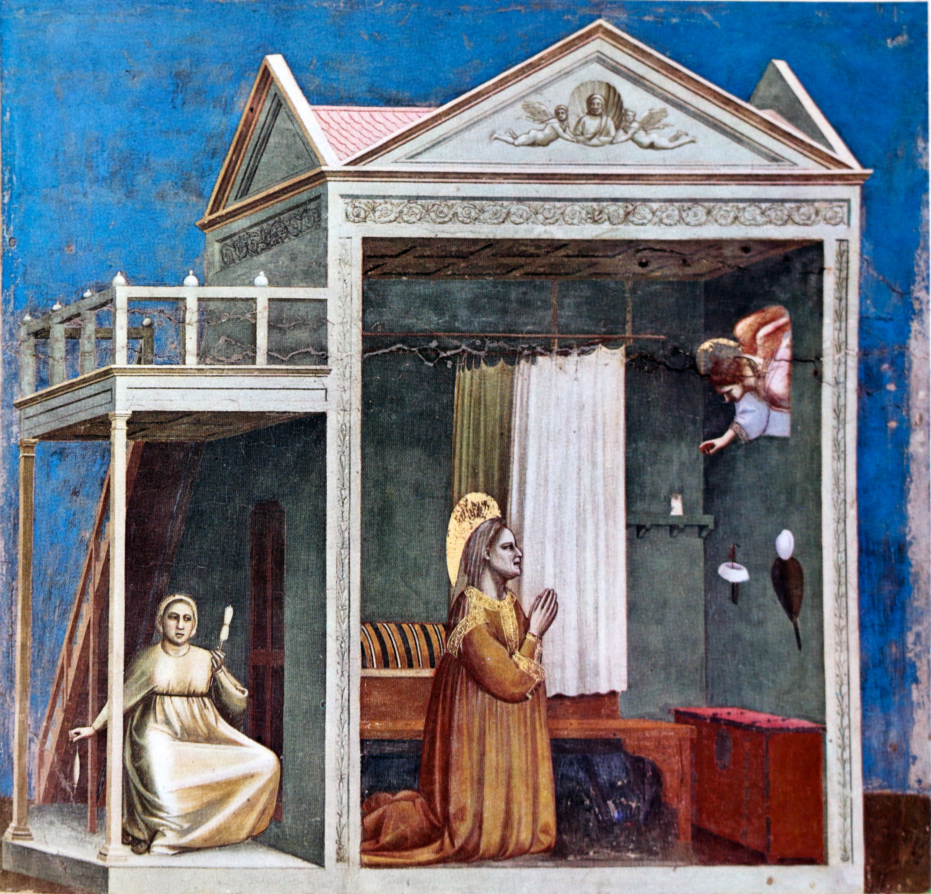
In the “Annunciation” above, there is a double attitude to space: one which looks back to Byzantine hierarchy, and one which presages the Renaissance.
To the left the angel and Mary are only just ‘anchored’ to the ground, and behind them is an impenetrable wall of flatness. Around their necks and draperies are vestigial shadows that suggest three dimensional form, but the figures are essentially flat and hieratic, like the Byzantine icon painting tradition from which they emerge. To the right, the walled city of Nazareth is depicted using the new tradition of spatial representation: the nearest planes are presented parallel to the picture surface, and the ‘receding’ planes sloping off diagonally to the right. Roofs are seen consistently from the top right, looking left and down, in a convincing quasi-perspective. Only the arched portal has proven a little awkward, spatially. The left and right sections of the composition are in contradiction. They use different conventions of space. The left decides on frontal, iconic representation which has no need of an illusionistic background, which could as well be painted in gold, as in an icon. The right hand side chooses space and recessive illusion.

In the Paris Psalter, the artist depicts a similar scene, but here the spatial illusionism is more coherent, and the colour also begins to function in a different way. Here, there is one space for figures, buildings, mountain and city. There is a sense of directional lighting: the left side of the walls and arches is illuminated brightly by sunlight, whilst the right hand side is cast in shadow. There is a clear spatial organisation from the front of the picture plane, contingent to ‘our’ space, receding just enough to create a shallow ‘stage’ for St Anne, and then, like a theatre backdrop, is depicted the architectural and landscape features which narrate the setting. It is true that behind the mountain, the impenetrable gold sky of Byzantium still lurks, but the overall pictorial and colour organisation looks forward 500 years to Giotto’s Cappella degli Scrovegni.
Here we see the sideways view into a structure whose frontal plane is parallel with the picture plane, and abuts ‘our’ space, together with the diagonal view, receding spatially to the left. With Giotto, the cubic space has been conquered, together with what can best be described as a masterful economy of everything else. There is nothing inessential in Giotto: The space is clear and sufficient for his narration; the colours are pure and wonderfully harmonious; the modelling is absolutely clear and formalised; the key narrative elements have been selected and organised with maximum clarity; and presented with a masterful psychological and dramatic sense. We clearly understand Giotto’s ‘directorial’ hand creating his theatrical space, organising the actors within it, clarifying lighting, costume and rhetorical gesture to maximise the impact of the story to be told.

In “The Expulsion of Joachim from the Temple”, Giotto uses the convention of the diagonal view into a receding cubic space to create just sufficient theatrical reality for the action to take place. The front edge of the temple floor, contingent with our space, leads us into the action. The drama unfolding inside and outside is artfully explained by a sort of ‘cut away’ view, from slightly ‘above’, so that we can see both spaces at once. Spatial recession is convincingly suggested by the logical perspectives of the two taller structures – the roof and the altar. And we have no need of anything else. The narrative is clearly and succinctly told.
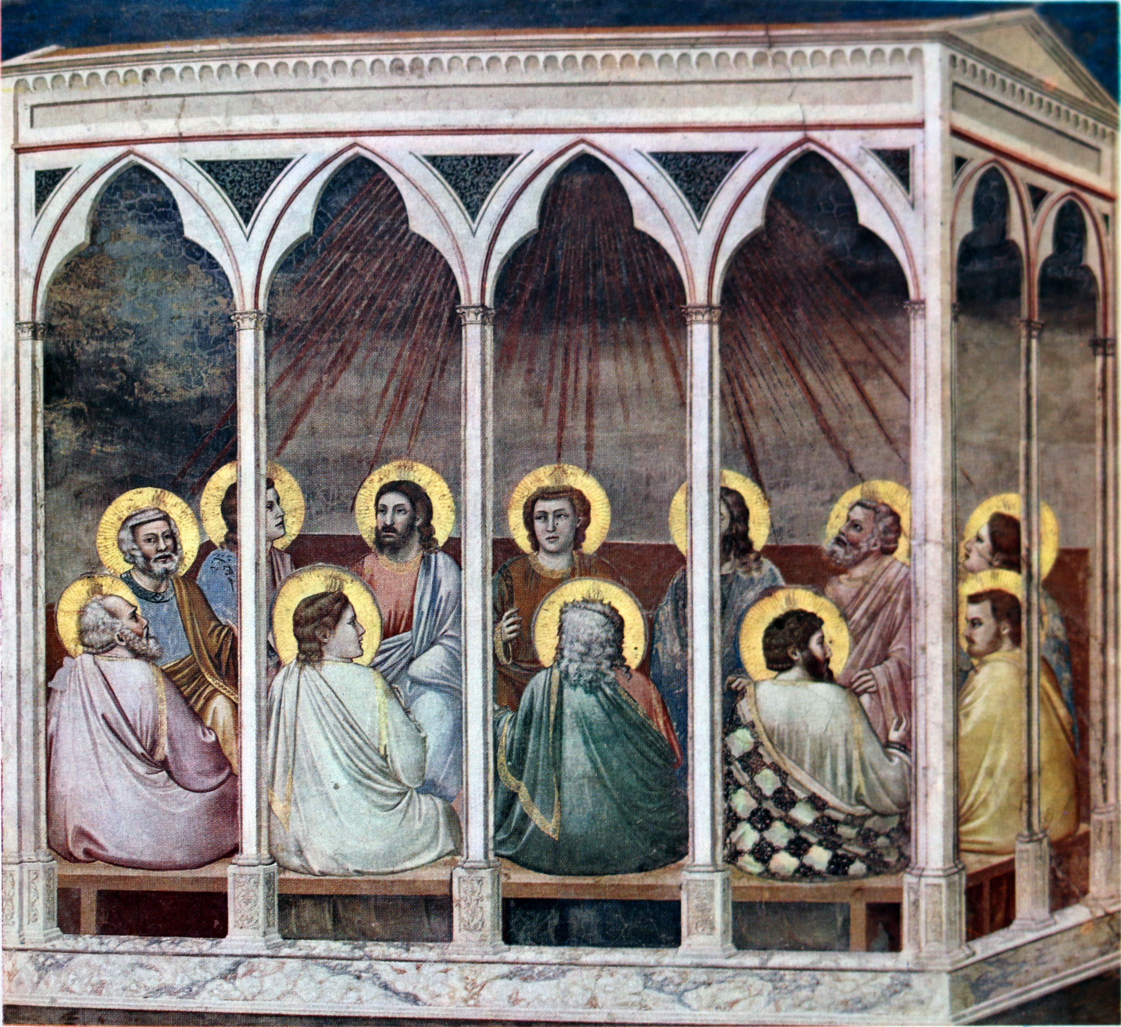
If we compare our first depiction of the Pentecost from the Bible of San Callisto, Reims, with Giotto’s version around 530 years later, we can see evidently how Giotto has mastered spatial illusion and narrative clarity.
Once space has been conquered, artists are freed to develop their compositions in two and three dimensions, as well as to explore the expressive and abstract possibilities of colour.
Geertgen tot Sint Jans

Max Friedländer, in his survey of Netherlandish art, (From Van Eyck to Brueghel” (Oxford, 1956), reminds us that almost the sole surviving representative of 15th-century Netherlandish art, is the painter Geertgen, of the Brotherhood of St John, who was born in Leyden and worked in Haarlem between 1475 and his early death, at around 28, in 1495. Only 13 or 15 paintings are generally ascribed to him, mostly painted around 1490. Despite this evanescent presence on the stage of world art, Geertgen has undoubtedly left us with some beautiful masterpieces, one of which we are lucky enough to have in the collection of the National Gallery, London, ” The Nativity at Night” (1490/95), above.
The Christ child functions as a literal light source in this painting, brightly illuminating the faces of Mary, on the right, and the adoring Angels to the left, and to a lesser degree, the lowly oxen to the centre-left. Typical of his style, the female heads, particularly, tend towards smooth ovoid forms with only slightly protruding noses. Further right, backstage, as usual, even Joseph, modest and self-effacing as ever, receives some of the light of Salvation. It is perhaps arguable whether he receives more or less light than the Oxen. Otherwise, all is dark; black as the night of our ignorance and sin, (“Black as our loss, Dark as the nineteen hundred and forty nails upon the Cross..” as Edith Sitwell was to intone much later), except for the flash of ecstatic illumination which highlights, for a moment, the astounded shepherds, guarding their flocks upon the hills behind. The apparently simple fact of a baby lying in its crib at night, has caused a cosmic turmoil. Shadow is finally banished, and the world is changed for ever.
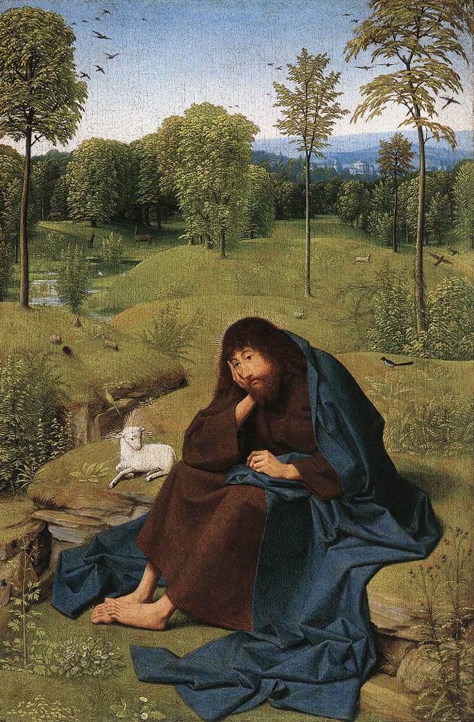
In “St John the Baptist in the Desert” (1495-90) Geertgen gives us a painting of melancholy and introspection. The ‘desert’ in fact is not so bad – a beautiful Netherlandish landscape, replete with lush foliage, contented wildlife and a distant hamlet, nestling in the pastoral sunshine. Only the solitary magpie – one for sorrow – alludes to the introspection of the Saint, heavy with his existential burden. The Lamb beside him, whose halo defines him as a personification of Christ, and the rabbits who remind us of regeneration, are somehow little solace to our deeply pensive Saint.
And perhaps his melancholy is not unwarranted, given his personal fate and that of his presumed cousin, Jesus.
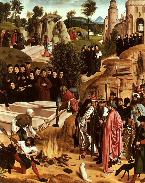
Once part of a larger altarpiece, commissioned by the Haarlem Order of
St. John of Jerusalem, of which Geertgen was probably either a member or protectee. The central ‘Crucifixion” has been lost, but the the side panels including this painting and the “Lamentation over the Dead Christ”, are both in Vienna. In 1484, Sultan Bayezid gifted the order, (then called
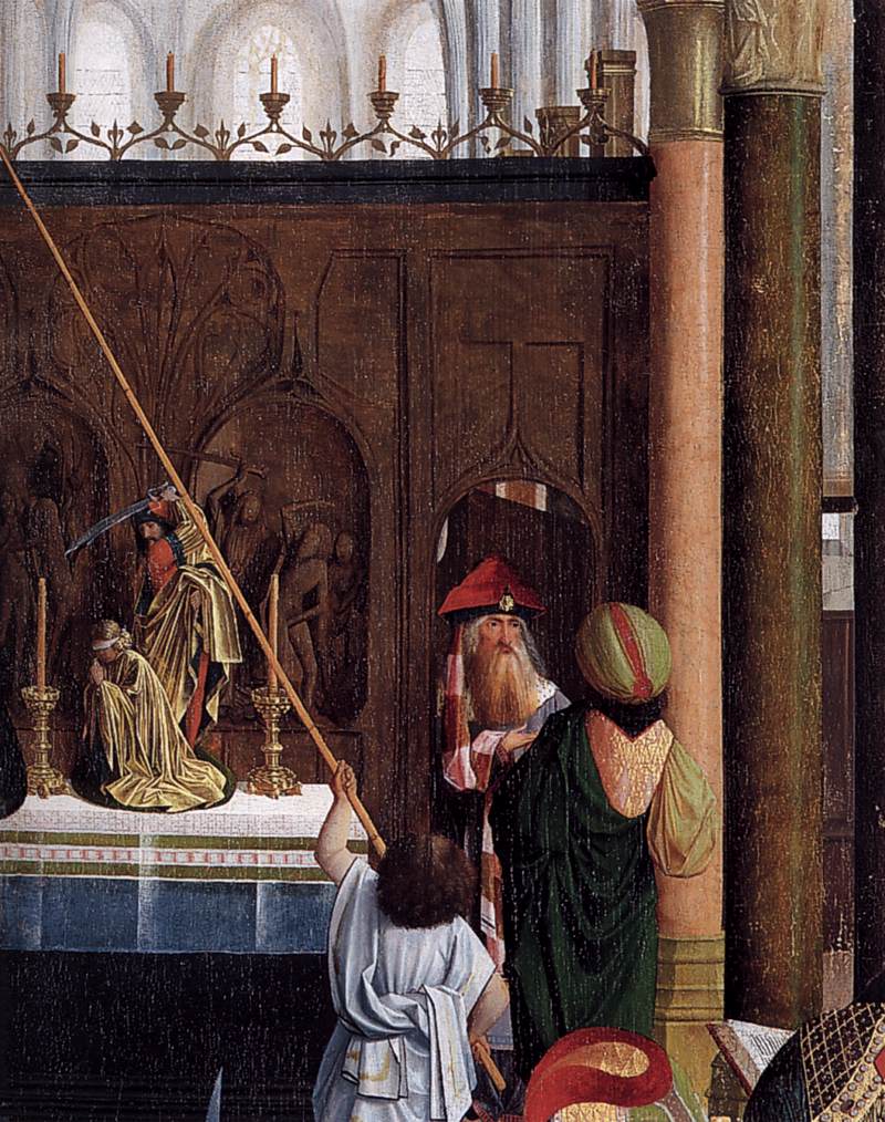
the Knights of Rhodes), the relics (arm and fingers) of St. John the Baptist from Jerusalem. The Biblical story tells how Herodias persuaded her daughter, Salome, to demand the head of John the Baptist from her stepfather, Herod Antipas, in return for her dancing at his birthday feast. Geertgen depicts the aftermath: the burial of St. John in the background, while Herodias is seen hiding her head in the palace garden, stretched out behind the tomb. According to medieval legend, Emperor Julian the Apostate (361–363 AD), who appears with his entourage at the front of the painting, later ordered the burning of St. John’s corpse. But monks who happened to be present prevented the complete destruction of the relics. In Geertgen’s version, a delegation from the order is seen standing at the open tomb; at the upper right they are transporting the saved relics to Jerusalem. Geertgen arranges the various episodes of the story chronologically from bottom to top, but unlike other southern Netherlandish and Flemish works, each group of figures, even those further away from the viewer’s eye, are presented as if directly in front of the viewer. The clear lighting illuminates all the details equally. The group of figures standing at the open tomb is also the first group portrait in Netherlandish painting. Geertgen gives equal prominence to each individual in the collectivity that has commissioned the painting, a feature that appears in later works, such as Rembrandt’s “Night Watch”.
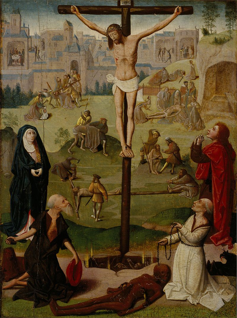
Although the central panel of the Vienna “Cruxifixion” is missing, this painting by Geertgen or his circle, in Edinburgh, gives us an idea of how it might have appeared. The landscape to the left rises from the hills and fields towards the walled city, rather as that on the right of the “Burning of the Bones of St John the Baptist”; and to the right of the Crucifixion, the Rocky promintory of Golgotha also descends from about the same place, to the left of the “Lamentation over the Dead Christ”, to the flatter plain below. Artists often used the same or similar formats for different versions of the same subject.
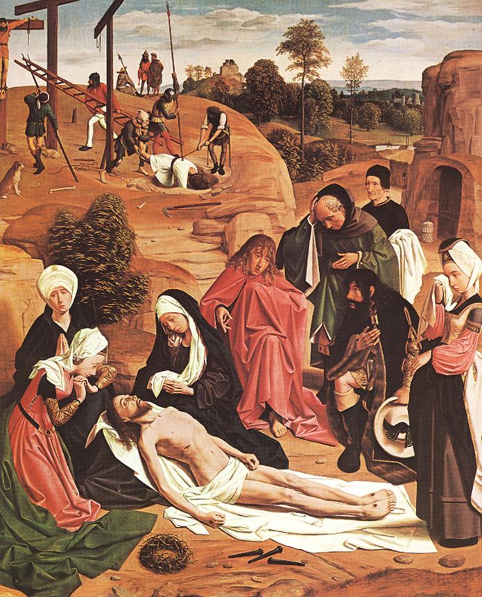
In the Vienna, “Lamentation”, the second panel of the lost “Crucifixion”, Netherlandish landscape floods back in, to give air and light and distance to the imaginary Holy Land, as in the ‘John the Baptist in the Desert’. Behind is an action-filled narration of the deposition and entombment of the two thieves. Soldiers, raise ladders, take down the bodies, and push them unceremoniously into the pits they have dug. A dog sits patiently watching. Below, in the foreground, the followers and family of Christ, circle around his body, rigid, and semi-upright, their gestures demonstrating various forms of grief using the rhetoric and gestures of oratory: clutching both hands below the chin, holding their head with one hand, wiping a tear from one eye. Prominent, in the foreground, are the instruments of the Passion: the three nails and the Crown of Thorns. Presented to us, as the nearest objects to our eye, so that we might fully appreciate their significance, and in their realism, accept them as part of our own world, which seems to be a continuation of the depicted scene. Through their convincing realism, we can take them up, accept their spiritual challenge.

In the “Man of Sorrows”, Geertgen reverts to mediaeval depictions of the suffering Christ, a theme which continues, in a particularly graphic Northern tradition, through to Mattias Grünewald’s “Isenheim Altarpiece (1512-16) in Colmar. The realism of embodied physical pain and suffering here takes precedence over Renaissance illusionism when it comes to landscape and setting. Again, the ovoid shape of the female heads with their delicate noses, is a tell-tale sign of Geertgen’s personal ‘handwriting’.

In this bustling interior of a Netherlandish Church, all the family of Christ are represented, St Anne and her husband Joachim, Mary, Joseph and Christ, St Elisabeth, (cousin to Mary) with her son John the Baptist, Mary Cleophas (profile) and Mary Salome (behind Elisabeth). The three boys in the middle can be identified as Simon Zelotes, (Son of Mary Cleophas and Alpheus), St John the Evangelist (with Chalice) and James the Greater (with barrel of wine) (Sons of Mary Salome and Zebedee).The other figures are possibly the other three sons of Maria Cleophas and Alpheus: James the Less, Jude Thaddeus and Joseph the Just, and Cleophas (St Anne’s second husband), Alpheus, Salomas (St Anne’s third husband) and Zebedee (Mary Salome’s husband). What is beautiful about it is the arrangement of cool pinks, greens and blues, both in the draperies of the leading figures, but also in the way these colours are echoed in the geometric floor tiles of the Church interior. The scene is staged in a perspective which begins with our space at the front of the picture surface and continues in depth to the altar, where a disturbing echo of the “Expulsion form Paradise” (in the wooden relief of the reredos), is transformed into the martyrdom of a Christian Saint, (Agnes?), via a reference to the Sacrifice of Abraham.
But it is in his depictions of the Madonna in which Geertgen shows his most ecstatic and mysterious aspect.

Also known as the “Madonna with Musical Angels” the painting once formed part of a Diptych (The Rotterdam-Edinburgh Diptych). Around the central figure of Mary with the infant Jesus are three concentric rings and a central halo behind them. The reference comes from the Book of Revelation, to “The woman clothed in the Sun”, which was interpreted as representing the Madonna in heaven. The Angels who circle around the Madonna and Child are all playing musical instruments, (the oldest depictions of musical instruments known in Netherlandish art). The infant Jesus is shown playing a pair of bells, one in each hand, as if in response to one of the angels in the outermost circle, holding an identical set of bells and looking directly back at the infant Jesus. Under the Madonna’s feet she crushes the serpent, as a symbol of victory over death (her Assumption into Heaven) and of the primal Sin of Eve.
Howard Hodgkin
I saw this painting in 1976 at the Howard Hodgkin retrospective exhibition at the Serpentine Gallery, and was blown away. It remains one of my favourite paintings today. To begin with, I did not immediately understand the link between what I was seeing and the title, but I sensed, by its sheer power, that this was indeed a figurative painting, rendered in a new way, and I found it exciting, puzzling and beautiful. I wrote to Hodgkin shortly afterwards and asked to come and interview him. I had decided that I would write my undergraduate dissertation about his work. He gracefully invited me to his studio in Oxford – he was then artist in residence at Brasenose College – and I spent a memorable day with him in his studio, talking about art, his current work in the studio, his way of working, his thoughts about his own and other people’s art. I still have the interview on tape and transcript, and it formed the basis of my thesis.
My thesis (1977), looked at Hodgkin’s work in the light of linguistic theory, specifically the work of Ludwig Wittgenstein, Noam Chomsky and Roland Barthes. I won’t go into detail here, but the aspects I was looking at explained how verbal meaning is constructed out of arbitrary elements, compiled together using conventions such as grammar and how these operate on a ‘deep’ and ‘surface’ level; such that apparent meaning is not always the same as actual meaning. Wittgenstein’s ‘Tractatus Logico Philosophicus” (1921) demonstrates that many, if not all, of the mysteries of philosophy remain so because we are asking the wrong questions. Chomsky’s “Syntactic Structures” (1957) explains how verbal meaning draws on deep grammatical structures to create a surface structure of meaning. Barthes, “Mythologies”(1956) explains how cultural meanings (books, films, adverts, tv, fashion, games, etc) really communicate multiple and at times opposite meanings, and are always socially contextualised.

The other tools I needed to understand what Hodgkin was doing were a knowledge of Indian Miniatures (Hodgkin was a collector and an expert and had spent much time in India visiting friends like Bhupan Khakhar); Knowledge of Synthetic Cubism, particularly the work of Juan Gris in the 1920s; knowledge of the Renaissance tradition of ‘box-like’ space, as in Giotto, above; an awareness of Pop art and Hodgkin’s contemporaries – David Hockney, R.B.Kitaj, Patrick Caulfield, Robyn Denny; a knowledge of Matisse, and the history of Abstract painting from Kandinsky onwards through to American Hard Edge abstraction, Neo-Geo and Minimalism; and an awareness of how his own art had begun and developed over time. These were the essential keys to his work.

The Deccani miniature illustrated above gives a clue to what Hodgkin derived from Indian, Mughal, and Persian miniatures. The flatness, bright colour, bold contrasting framing, the division of the picture plane into discrete decorative zones; the integration of figurative and abstract elements, the freedom of the perspective, and the narrative figurative content.
From Juan Gris, but also from the later Synthetic and Rococo Cubist work of Picasso and Braque from the 1920s, Hodgkin has drawn certain elements of his visual range. (Note that I do not use the erroneous term ‘visual language’ of which there can be no such thing: a language requires a grammar and a syntax, and visual art operates on much more ambiguous ways). But the way in which Gris uses areas of solid colour to suggest solidity and opaque planes, and areas of dotted colour, to suggest more airy, insubstantial matter, Hodgkin adapts frequently to imply differences in substance/materiality, for example the ‘buzz’ of conversation in an interior space.

Critics often confused Hodgkin, in his early career, with the ‘Pop artists’ who were his contemporaries, and although he was always a more ‘classical’ painter, whose concerns were primarily with the interface between abstraction and figuration, he did nevertheless derive some of his stylistic tropes from Pop Art – In the Caulfield above, the artist plays with multiple forms of representation in the same image. Although discrete parts of the image are painted using different visual conventions: a ‘posterised graphic’ style, a flat decorative style, and photo-illusionistic painting, the drawing nevertheless unifies the composition, and we have no difficulty in ‘reading’ it as one image.

For a colourist like Hodgkin, eager to acknowledge and incorporate stylistic tropes from the entire history of art, and also, resolutely, a modernist, eager to make of the past something new and fresh for the present, it is inevitable that Matisse looms large as an influence. The greatest colourist of the 20th-century, and one of the boldest in pushing figuration to the limit of abstraction, Matisse’s unique colour sensitivity, and the virtuosity of his drawing and design are unrivalled. Hodgkin draws upon his work repeatedly. It is a constant source of inspiration; and he shares too that interior, private, domestic intimacy too: his subjects are most often his friends and collectors, fellow artists in their interior spaces, talking about art.

142 × 206 × 3.8 cm
From Kenneth Noland and a wide range of US abstract painters, Hodgkin draws some of the boldness of his stripes and blocks of colour. Abstract art, since the early efforts of Kandisnky and others at the beginning of the 20th-century, has developed its own, more or less, autonomous stylistic range. It is in fact hard to avoid ‘quoting’ abstract painters, when a wash of sombre brown and ochre instantly recalls Rothko, or a vertical ‘zip’ of one colour on a contrasting colour inevitably brings Barnett Newman to mind.
Another way to grasp what Hodgkin is doing is to think of Jazz, especially in its early years, or indeed a classical ‘Theme and Variations’. The musician started with a theme, or easily recognisable tune. This was then developed and abstracted away from its original source until it almost looses trace of it. But the harmonic structure and chordal progressions never let the original theme stray too far from the memory of the original theme.
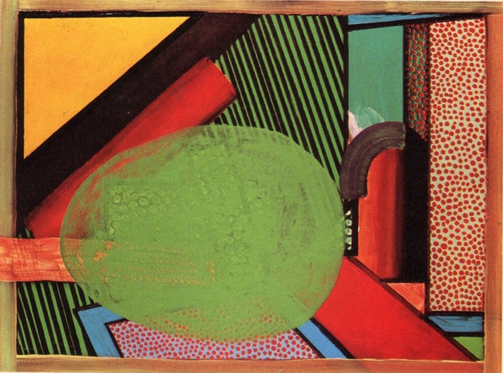
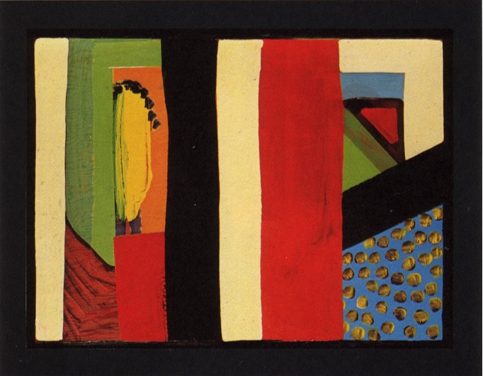
To return to our first two images: Hodgkin explained to me that the two subjects were in fact identical and started more or less at the same time: The subject of both was Mr and Mrs E.J Power in their sitting room in London. In the first, the two figures, or rather their presence in the room, has evolved into the great green egg-shape occupying the central space, surrounded by the interior details. In the second, the improvisation has moved sufficiently far from the original figurative depiction that the characters have more or less disappeared, (one is literally exiting by the door at the back) and the interior of their house has taken over as the ‘real’ subject of the painting: hence the difference in their titles.
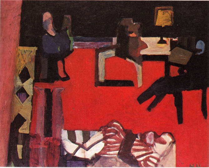
In Hodgkin’s early work, the figurative starting point is still fairly evident. Here an interior with red carpet, a reclining female figure in striped dress in the foreground, a seated male figure to the right, behind him a table and desk lamp, on to the left another seated, possibly female figure. As the image has progressed over time, Hodgkin has slowly begun to efface the figurative elements, leaving just enough information for us to grasp the sense of an occupied interior space. The redness of the carpet has begun to pull away from the distance and float to the surface as he re-emphasises its flatness, as in Matisse had done in his “Red Studio”.
In “The Second Visit”, almost everything has been effaced by the overpainted white. Originally, there was a hotel corridor, looking down to the surviving arched doorway, to either side doors, and a geometric carpet on the floor. Very little is left except the sense of an enclosed space, and perhaps a distance between us and the far off door.
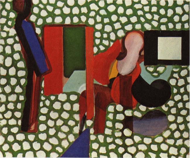
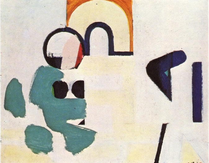
Around 1963-4, Hodgkin started to ‘build up’ his pictures in an additive and constructive fashion, rather than progressively ‘effacing’ them as he had done before. Now he increasingly drew on his acquired ‘vocabulary’ of inherited forms: the all over dots, to suggest negative space or human activity in a space, which derives from Synthetic Cubism, and the various figural stylisations deriving from Matisse and Pop art. Certainly, there could not be a style further removed from the constructivist logic of his two painter friends who form the subject of this double portrait.
For the rest of his life (Hodgkin died in 2017), Hodgkin continued to refine this additive and constructive approach, extending to several series of screenprints, but mostly staying with his familiar, medium sized, oil on old drawing boards, worked and reworked for many years. His oeuvre is, as he said to me, ‘entirely derivative’ in its constituent parts, but about as original and inventive as a painter has been in the 21st-century.
Two Venezuelan artists

I saw this work first in 1972, in a touring show from the Midland Group Gallery, Nottingham, at the Ferens Art Gallery, Hull. It comprises a hand drawn background of black lines on painted chipboard, in front of which dangles a thin iron rod suspended on fine nylon thread. As you, or slight air currents, move around the work, an optical interference or dazzle occurs at the interface of the black lines and the edge of the metal rod. It is impossible to avoid these optical disturbances as neither you nor the work are ever really still, and even in the case of a photograph, the straight line of the iron rod appears as a zig-zag or stepped line. Jesus Rafael Soto (1923-2005) was a Venezuelan artist who specialised in this type of optical effect, and thus falls under the ‘Op-Art’ label. Op-Art, is usually associated with Hungarian/French artist Victor Vasarely (Győző Vásárhelyi, 1906-1997), whose characteristic work uses slight variations in size or shape in a serial sequence of squares or geometric shapes to create a billowing visual distortion. In Britain is represented most notably by Briget Riley (b.1931), who similarly creates optical disturbance by closely aligned parallel lines in waves and stripes.

Museum of Fine Arts, Houston, USA.
The Franco-Venezuelan artist Carlos Cruz-Diez (Caracas, 1923 – Paris, 2019) lived and worked in Paris from 1960. He too is a major exponent of Kinetic and Optical art, with a particular interest in the interactions of colour. For both artists, the optical effect stimulated by looking at their works is of primary importance. What follows is then an awareness of the existential moment, a direct physical interaction between the work and the viewer, which, before Op-Art, had been rare in art.

With Cruz-Diez, the existential moment is perpetually repeated and yet always changing as the viewer moves slightly, and never quite repeats the exact same viewpoint. The colour and the work remain the same, but the effect, contributed by the eye of the beholder, is never fixed. There have been few artworks which so authoritatively place the spectator at the heart of the experience.
Jesus Rafael Soto also moved on to explore the effects of moving bands of colour – here, ribbons of coloured PVC – which are animated and activated by the physical passage of the spectators through the optical field.
Critics of Op and Kinetic Art see it as ‘lightweight’, tricky or gimmicky, because it concentrates on, some would say, limits itself to, creating a direct effect on the spectator, like a magic trick, at the expense of deeper, philosophical meaning. But in fact the history of Modernism has been one of a progressive, radical simplification of art’s means. The Impressionists tried just to see the world as a series of colour/tone patches, which meant that classical, Renaissance drawing, was not required – edges tended to disappear as the accurate observation of colour-tones predominated. Cézanne’s attempt to discover a hidden order and geometry in the visible world, also led to a progressive ‘simplification’ of the anatomies of his figures, or the key forms in a landscape, although it must be said that he brings with this search, a deeper understanding of the complexities of binary vision and the interactions of colour across a surface. Minimalism, to take the most extreme example, reduces painting to one or two colours on a flat surface and sculpture to a prime geometrical shape. This is not to say that there is not complexity and subtlety within the work. It is just that Modernist artists have set themselves very particularly defined parameters within which to work.
So in defence of Op Art, I would recommend a closer look at Soto, Cruz-Diez, and the particularly rich seam of experimental art coming out of Venezuela in the 1960s and 70s. Like Mondrian, their work is decisively abstract, follows a clear and logical direction, is uncompromising, honest and open to direct dialogue with the spectator.
Donatello
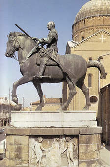
“The greatest Florentine sculptor before Michelangelo and the most influential artist of the 15th-century; most Florentine painting stems from him, as does the whole Paduan School..” so say Peter and Linda Murray of Donatello (c.1386-1466) in their classic “Dictionary of Art & Artists”(1959/1987). Apart from being one of the first artists to master his friend Brunelleschi’s one point perspective and make convincing recessional figure compositions in bronze and marble relief, Donatello also mastered the Classical art of ‘lost-wax’ casting, achieving, in the the ‘Gattamelata’ in Padua (1443-53), the first full size equestrian bronze statue since Roman times; his model being the Marcus Aurelius in Rome.
The ‘lost-wax’ technique is a way of creating a hollow metal form, such as a bell or a figure, from a modelled plaster or clay original. Having produced your original, with as much surface decoration and detail as you require, a mould is made, usually in two halves, with a smaller mould placed within. The resultant gap of a few millimetres all round, is then filled with wax. The two moulds with their inner layer of wax are placed, usually upside down in a pit filled with sand and molten bronze poured in to special vents or conduits which carry the bronze to the wax layer. The bronze has to be poured quickly and consistently so that it rushes round every detail of the form, melting the wax and replacing it with metal in one continuous form. If air bubbles or detritus get in the way, all is ruined and the work has to start again. It is a highly skilled endeavour, whose secrets, known to the ancient Greeks and Romans, had been lost for centuries, but were rediscovered following archeological excavations in Rome to which Brunelleschi and Donatello were party.
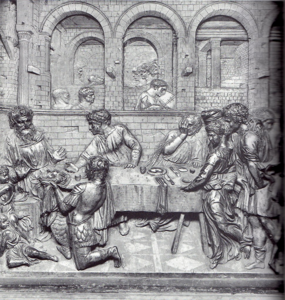
As a close friend of Brunelleschi, Donatello was one of the first to appreciate and master his friend’s invention of single-point perspective, by means of which, a convincingly recessive scene can be created on a flat surface following mathematical principles. Although primarily a pictorial device, this did not deter Donatello, who was consistently experimental throughout his work, from the challenge of using it to create a deeply recessive vista in a shallow relief sculptural plaque. The “Feast of Herod” is a tour-de-force in many respects. The artist creates a series of receding spaces, one for each stage of the narrative, from the furthest set of arches, where the head of St John the Baptist is being presented to Salome and Herodias, to the middle set of arches, where the musician plays and two classically inspired heads listen, forwards to the frontal stage-like space where the feast is occurring and the head is being presented to Herod at table. And yet the bas-relief format is antithetical to deep spatial recession, just as sculpture is inherently not pictorial. Furthermore, the heightened expressivity of the scene – Herod recoils in horror, as does the figure seated next to Herodias, and the swirling draperies of Salome to the right, seem to recall the movement of her dance, and carry forward its expressive movement into the feast scene – function in a way which is pictorial rather than sculptural.
He also worked with a surprisingly wide variety of materials: bronze, marble, ceramic, wood, mosaic, plaster and polychromy; sometimes incorporating them all in the same work.

The portrait bust of Niccolò da Uzzano above, similarly revives the Classical Roman portait bust, presenting both a highly individuated representation of a particular Renaissance individual as well as a slightly idealised portrayal to suggest links with the preceding tradition of Roman emperors and noblemen, thus inferring their nobilty and gravitas on Donatello’s contemporary.

Donatello was known for the striking expressivity of his sculpted characters: The statue of “Habakkuk” for the Campanile (bell tower) of Florence Cathedral (c.1427-36) is affectionately known as the ‘zuccone’ (‘melon-head’) for its round, bald-headed and wide mouthed character.

The ‘Jeremiah” (c 1423-5) for the same site, grimly determined, clasps the drapery by his side. His posture reflects the classical ‘contraposto’ stance, with weight resting on one leg, and torso slightly twisted round.
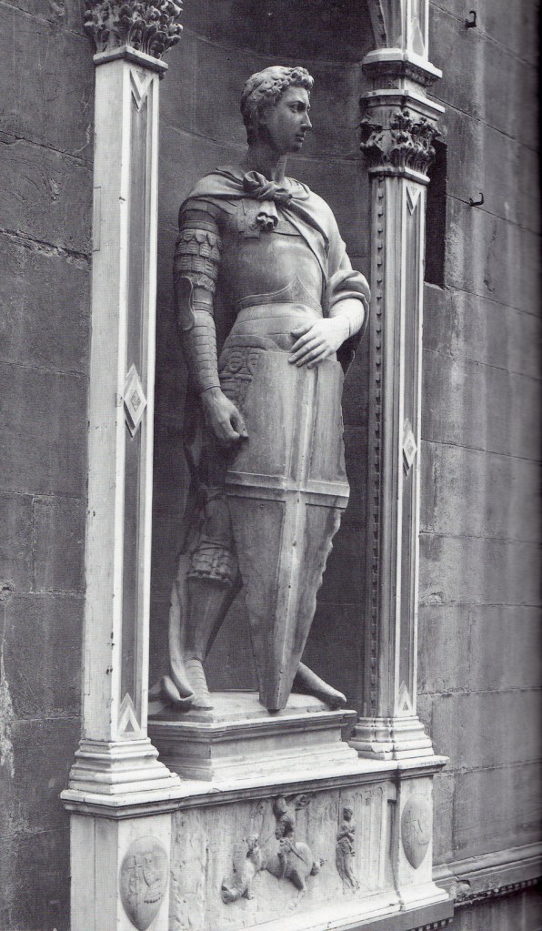
While the “St George” (c.1415-17) for Or San Michele, Florence, depicts a youthful warrior, steadfastly staring out from his niche, ready to boldly confront his adversary. In contrast to the previous example, the St George is standing full square, with weight resting on both legs equally, in a more confrontational pose.
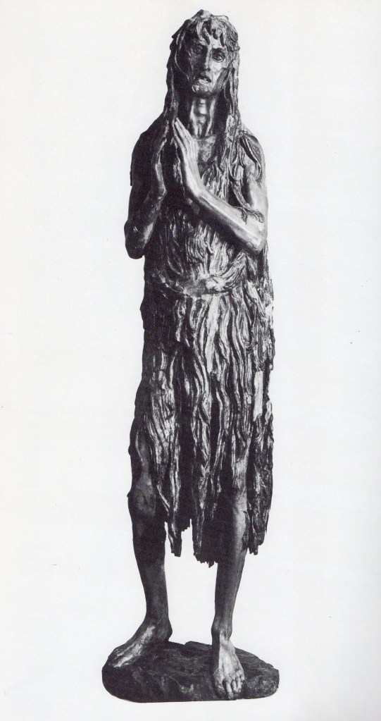
But perhaps his most extraordinary work is the late “Penitent Magdalen” (late 1430-s-50s), in the Museo del Opera Del Duomo, Florence. Carved from wood, with polychromy and gilding, it is an astoundingly modern embodiment of the ravages brought about on the physical body by grief and age. The Magdalen is reduced to an elongated, emaciated, quasi-skeletal figure, her hollow cheeks revealing the bone-structure beneath, and her lank, knotted hair continuing its straggling dishevelled way to cover her body. The Biblical story of Christ at the house of Simon the Pharisee (Luke 7:36-50) recounts how Mary Magdalen, believed to be a beautiful and wealthy harlot, washed Christ’s feet with her tears and dried them with her long hair. Christ declared that she should be pardoned for her previous life. Her story continues with her part in the Passion, and the Golden Legend tells of her life after the Resurrection, when she retreated to the South of France, living a life of fasting and penance as a mountain hermit, clothed only in her own hair. In Donatello’s depiction, her hair is both a symbol of her former beauty and sensuality as well as an emblem of her later repentance and neglect of worldly things.
